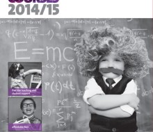
The HE prospectus is the key marketing publication to promote the higher education courses available at Vision West Nottinghamshire College (West Notts). The prospectus was printed lithographically and is also available to view and/or download online.
The target market were a combination of mature students undertaking study alongside work and/or family commitments, and current Level 3 students with the college to encourage them to continue studying to a higher level (the local community suffers from very high NEET figures and low aspiration levels with many families experiencing three generations of joblessness).
My role: project manager and graphic designer
Responsibility for: concept work (team), concept development (sole), image research and art direction of photo shoots (sole), content management (sole), project management (sole), artwork (sole), print management (sole)
Stakeholders: the college executive team and Principal, the Director of Marketing and Communications, Head of Marketing, Head of HE and International, relationship managers from partner Universities (University of Derby, Birmingham City University), Programme Area Leaders, tutors, HE support team, copywriting and proofreading team, students, alumni, guest speakers, external photographers, image libraries, litho printers
Concept: What did you dream of being when you were a child? Whatever your dream/ambition, you can achieve it with West Nottinghamshire College. The visuals used a series of 1940s/50s black-and-white images, with very tongue-in-cheek humour, which were used alongside the college branding guidelines for layout and typography.
Biggest challenge: to find/create the cover and subject-area images I had visualized within the £700 photography budget. I explored the idea of creating the images from scratch utilising college studios and hiring an external photographer, but the cost and logistics of finding props and models was prohibitive. I therefore took the image research route, researching royalty-free images wherever possible in order to keep the project on-budget. Image manipulation was required for some images, and this was done using Adobe Photoshop. The other, colour images within the publication were shot by an external photographer to a brief provided (and art directed where necessary) by myself.
Print and production notes: the artwork was created using Adobe CS6; the publication has a gatefold cover (front and back), UV lamination to the outer cover, and uses white silk paper stock
Result: the publication was sent to print 2 weeks ahead of schedule, delivered on budget, and feedback to date has been extremely positive.
HE prospectus 2014-15
- Categories →
- Graphic Design
-
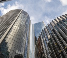
City of London

-
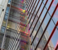
City of London – Bishopsgate

-
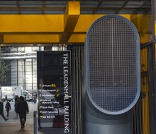
City of London – The Cheesegrater

-
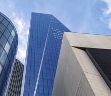
City of London – The Scalpel

-

City of London – The Can of Ham

-
Instagram – Cornwall

-
Instagram at the Seaside 2

-
Instagram – Heritage

-
City of London – The Walkie Talkie

-
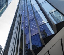
City of London – Willis Towers Watson

-
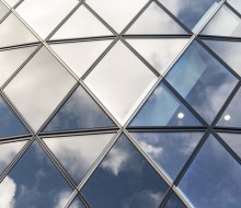
City of London – The Gherkin & The Shard

-
Reflections

-
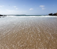
Cornwall 2019

-

Brand Hub

-
Overview 1

-

Overview 2

-
WYG AR&A 2018

-
WYG adverts

-

WYG booklets

-
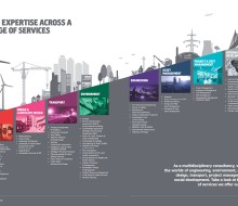
WYG ‘icon landscapes’

-
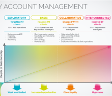
WYG graphics

-
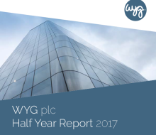
WYG Half Year Report 2017

-
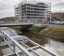
Kirkstall Forge Photoshoot II

-
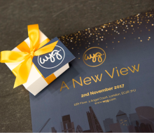
WYG event branding and invitations

-
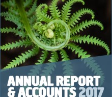
WYG Annual Report & Accounts 2017

-
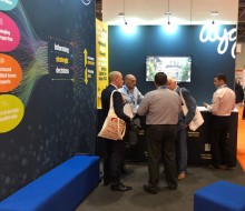
Event stands

-

Digital ads

-
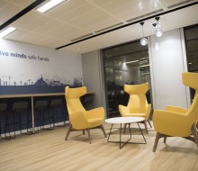
WYG interior design

-
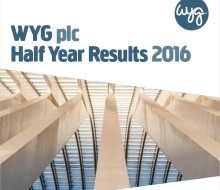
WYG half year report 2016

-

Windfarm installation

-
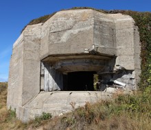
Atlantic Wall project – update 1

-
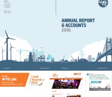
WYG Annual Report & Accounts 2015-16

-

Instagram in Scotland

-
Instagram in the Lake District

-
Manchester MediaCity

-

WYG staff portraits

-
Instagram weekend ramblings

-
Instagram at the seaside

-
WYG recruitment

-
WYG Infographics 2

-
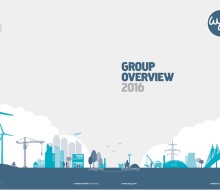
WYG Group Overview

-
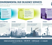
WYG infographics

-
Trains

-
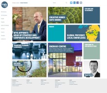
WYG website look and feel

-
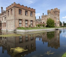
Heritage

-

Branding

-
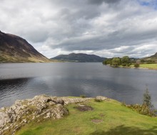
Lake District

-

WYG print adverts

-
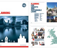
WYG publications

-
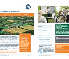
WYG flyers and posters

-
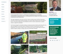
WYG Kirkstall Forge

-
Fishing harbours

-
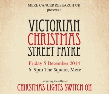
Charities

-

Wedding Stationery

-
Photo Research ‘B’

-
Baillie Gifford

-
Photo Research ‘A’

-

Kirsten and Ross

-

Northern Lights

-
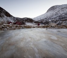
Norway

-
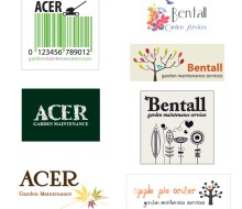
SME Identity and Brand Development

-
Seascapes

-

Equality And Diversity

-

College Literature

-
Intertidal

-
Vision Entrepreneur

-
HE prospectus 2014-15

-
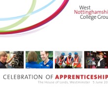
House of Lords Event

-
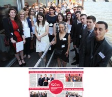
Education Sector

-
Inspire and Achieve Foundation

-
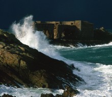
Alderney

-
Becky & Chris Wedding

-
Vision Studio School

-
Hair, Beauty, Spa

-
Event – HRH The Duke of York visit programme

-

HE prospectus 2013-14

-
Big Sky Photography Workshops

-
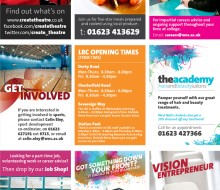
WNC Digital Advertising

-
Restaurant Logos

-
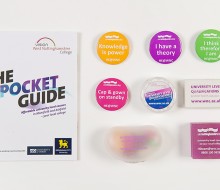
HE Promotion

-
Alison & Clive Married at Newstead Abbey

-
Wedding Attention To Detail

-

Interesting Idioms

-
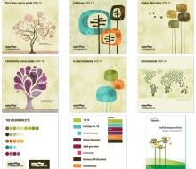
Brand Development – Tree Concept

-
Laura & Martin’s Alderney Wedding

-
Lake District

-
Sri Lanka

-
Iceland

-
Italy

Clients


